I recently began downloading and working with datasets available online in order to level up on my Machine Learning knowledge. The idea was to: (a) get my hands dirty exploring real world datasets, (b) solidify my theoretical knowledge of ML by implementing the techniques and algorithms, and (c) practice coding in Python and Numpy. This post is about the first dataset I worked with for this purpose.
Two weeks ago, I downloaded the Wisconsin Diagnostic Breast Cancer (WDBC) dataset from the UCI ML Repository, intending only to implement a couple of classifiers to model the data and then to quickly move on to the next dataset. Surprisingly, I found that even within this simply stated task, there was so much for me to explore and learn. I ended up implementing 3 different classifiers for the dataset. I will describe each of these in turn, outlining the results I achieved as well as enumerating the lessons learned from implementing them.
The Data
The WDBC dataset consists of 569 rows of various tumor measurements (such as radius, concavity and symmetry) as well as what the diagnosis was. About 38% of the cases provided were diagnosed malignant, the rest benign.
The modeling goal was to predict the diagnosis based on the available tumor measurements, i.e., a simple classification task. The dataset is also known to be linearly separable.
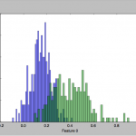
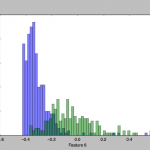
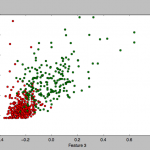
To get a feel for the data, I plotted some charts that depict the distribution of the two classes across one or two feature axes, for example:
I implemented 3 different classifier algorithms to run on this dataset:
- Bayes plug-in classifier with Gaussian class-conditional distribution assumption: This is a generative model. Each of the two classes is assumed to be Gaussian distributed, and we try to determine the parameters of the distribution.
- Naive Bayes classifier with Gaussian class-conditional distribution assumption: Similar to the above, but within each class, every feature column is modeled independently from the others.
- Perceptron: A simple gradient descent search for a hyperplane boundary between the two classes. I implemented both a stochastic and non-stochastic algorithm.
Bayes plug-in classifier
I decided to start with a Bayes plug-in classifier model with Gaussian class-conditional densities. This is a generative model, in which the two classes (malignant and benign) are each separately modeled as Gaussian distributions, and new data points are predicted simply as belonging to the class with the larger probability density.
The models generated from this classifier gave me a 94% accuracy on the test set, using a balanced 0.5 threshold for choosing between the two class densities. The misclassification errors were somewhat equally spread out between false negatives and false positives. Note that the dataset is known to be linearly separable, yet I didn’t achieve a classification rate any closer to 100%.
I plotted an ROC curve to determine how good the classifier was:
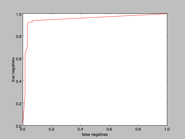
The “area under the curve” is substantial, demonstrating that the classifier was doing a good job.
To help find the ideal threshold value, I plotted threshold against true negatives:
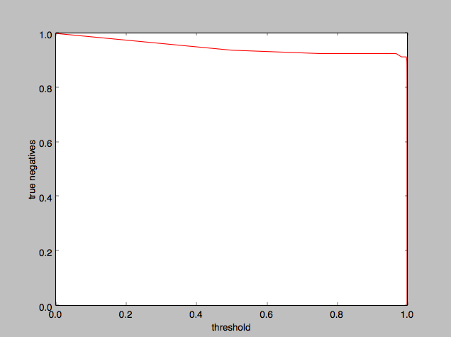
It appears that 0.5 is an okay threshold value to use, although we could as well have used anything up to 0.99.
Implementation notes
Here’s the fun stuff I learned while working on my first dataset building the Bayes plug-in classifier:
- Training and Test sets: I initially tried setting aside 1/3rd of the data set for Test and got about a 94% accuracy (with a higher Training set accuracy). However, I found that the accuracy gap reduced when I set aside only 1/4th for the Test set. (I wonder if this was merely the result of having more data to train on.)
- I tried changing which part of the data set to slice the 1/4th Test data from, and I got results that varied quite a bit especially in the type of error (i.e. false negatives vs false positives). I imagine that the dataset of 569 samples is simply not large enough to build a stable model.
- I was tempted to take an “average” of the different test slices (a la cross validation) but I think that defeats the meaning of “testing”.
- Validation sets: I did not have any validation sets because I felt I wasn’t optimizing on any parameters. Maybe “threshold” was indeed such a parameter but I preferred deducing it from the ROC graph.
- Adjusting Threshold: As we can imagine, getting a false positive for cancer diagnosis is relatively harmless in the real world while getting a false negative would be dangerous. So I decided to err on the side of positive diagnosis (i.e. minimizing false negatives), which corresponds to increasing the threshold. However, surprisingly, I found that the threshold value didn’t make a difference until it went above 0.9999 and more, and then the false positives started getting much worse. (See ROC graphs above.)
- Difference in height of class Gaussians: In an attempt to understand the data – and before I thought of plotting the “histogram” classes (shown earlier) – I hoped to plot a pretty 2 bell-curve diagram when I plotted the Gaussian PDF value of each data point against a single component feature of that data point. Instead what I got was:
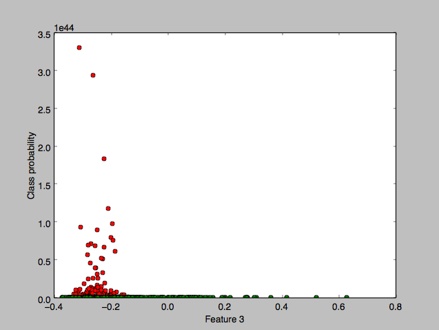 with a flat zero plot for the “malignant” class, where the x-axis component chosen is the mean area feature. Zooming in, I discovered that the green class was indeed gaussian too but at a much smaller scale:
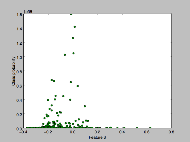
This seemed to explain why the threshold didn’t matter until 0.9999.. but I didn’t understand why the huge class difference.
The difference seemed to arise from the determinants of the two covariance matrices, which were wildly different. The first gaussian’s determinant was around 10-76 and the smaller one’s was around 10-66, a huge order of magnitude difference, and moreover both resulting in pdf probability values that vastly exceeded 1.
My first insight was in understanding why the pdf probability values could be greater than 1. Turns out, it’s not the pdf value that is constrained to 1, it is the integral (or area under the curve) of the pdfs that should amount to 1. So if the x-axis range of the pdfs is tiny, the pdf values can easily be >1.
My second insight was in realizing that this plot was misleading in depicting only one feature (in the x-axis), because the plot was not of the pdf marginalized down to that feature, it was the pdf value of the full-featured data points. The ‘ranges’ (or variances) of all the other axes mattered too.
Finally, after comparing the feature variances across the two classes (and noticing that the product of all the variances in each class were separated by approximately a 1010 factor) I realized that what mattered was the volume occupied by the gaussian, which is what the determinant represents.
Maybe next time, I should plot the marginalization of the pdf per feature. - ROC curve: I plotted a graph to display the false-negatives vs true-negatives, for the full range of threshold values. I got a plot similar to the one shown above.
In an attempt to have a smoother curve (and since it’s not obvious which threshold value lines up with which point on the graph) I coded up a greedy algorithm that intelligently fine-tuned the areas of the curve that needed fine-tuning. In the end, though, I obtained almost no improvement in smoothness. That’s when I realized that the stepped nature of the graph was actually caused by the data and not by the sampling method. - Significance of various features: Although the model seemed to work just fine, I wanted to understand better which of the features were more significant and which less. Initially I simply looked at the variances of each feature (i.e. the diagonal of the covariance matrix of the training set) but the values were spread out and nothing really stood out. (Moreover, I realized that while large variances were helpful in linear regression, perhaps they were inconsequential for bayesian modeling.)
Eventually it occurred to me that I could do something like Linear Discriminant Analysis (LDA) and use the coefficient weights as a proxy for importance. Since the Gaussians don’t share a covariance matrix, though, I’d have to use Quadratic Discriminant Analysis instead. I proceeded with this but ended up with coefficients of first and second-order terms (a vector and a matrix of coefficients) that didn’t tell me much, since it was a mix of positive and negative terms that could cancel each other out.
Perhaps a better way of doing this task (a task that is effectively feature selection) is to iteratively attempt dropping features that make the least difference, and ending up eventually with only the most important set. - Normalization: Initially while trying to figure out the wildly different gaussians, it dawned on me that I hadn’t normalized the data, and that this might be causing all sorts of weirdness. (I noted, though, that in calculating the gaussian covariance matrix the means were already being subtracted out.) It turns out that normalizing the data barely changed anything, in fact the model accuracy was exactly the same.
This makes sense, since normalization is mostly important when doing Regression, wherein we don’t want features’ individual weights to arbitrarily depend upon their value range.
Naive Bayes plug-in classifier
I next implemented a naive bayes classifier to use on the data. This technique would likely not have as high an accuracy as a full Bayes classifier (although the algorithm might run faster). Here, each feature is modeled separately with its own gaussian, and in the end the pdfs of the various features are merely joined (multiplied together) to determine an overall class probability.
Using the same training and test sets as in the Bayes plug-in classifier earlier, I obtained a 93% accuracy on the test set, with the errors leaning more towards false negatives than false positives. This is only slightly worse than the full Bayes Gaussian classifier but it’s worrisome that the more malignant cases are going undetected.
Plotting the ROC curve for Naive Bayes:
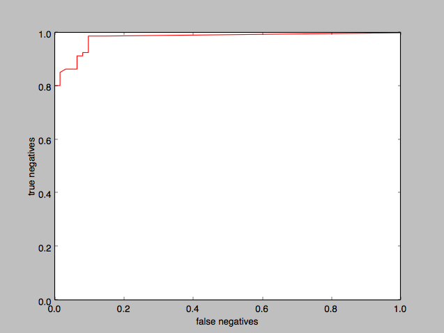
and plotting the threshold on the x-axis:
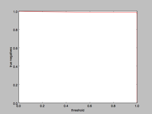
Again it appears that a 0.5 threshold is reasonable, although we could take it all the way to 0.99 and higher with barely any noticeable difference.
Implementation notes
The Naive bayes classifier was only a small tweak away from the full Bayes classifier, so nothing new here.
Perceptron
Unlike the previous two classifiers which were generative models (i.e. we modeled the classes directly), the Perceptron is a discriminative classifier, i.e. it focuses on finding the dividing boundary between the two classes without worrying about the underlying model. This was one of the first ML techniques ever developed, half a century ago, and although it has been superseded with more robust techniques like Logistic Regression and Support Vector Machines, I decided that this was still worth exploring. I implemented both the offline (batch) perceptron and the online (stochastic) perceptron.
Luckily for us, the dataset is known to be linearly separable, i.e., it is possible to find a linear boundary that perfectly separates out the two classes in the data, and therefore a simple perceptron should be able to succeed.
I first implemented the batch perceptron. Training on only 3/4th of the full dataset, it converged on a linear boundary that gave me about a 95.5% accuracy on the remaining portion of the dataset (i.e the test set).
Running the stochastic perceptron on the same test configuration gave me about a 95.6% accuracy, which is essentially the same.
Note that these test accuracies are both better than the Bayes models we saw earlier.
Implementation notes
Implementing the Perceptron turned out to be trickier than I expected, and I learned a lot from the process.
- Normalization: I was initially only getting an accuracy of 88.7%, but upon normalizing the data, that shot up to 96%. This makes sense, because without normalization the perceptron would have a harder time finding the hyperplane along the axes whose features had very small ranges.
- Adding a basis: Initially I found that changing the learning rate η had absolutely no effect on the results. The iterations played out identically, no matter the learning rate. The only thing that seemed to change was that the components of w scaled in size inversely to η while still maintaining their relative proportions. This clue helped me realize that my perceptron was only looking for hyperplanes that went through the origin.
The solution was to add an extra basis weight (or equivalently, adding to the data a new column of 1’s). This fixed the problem. - Fluctuations and spikiness in performance: When implementing the batch perceptron, I noticed right off the bat that the perceptron struggled to converge, there being considerable misclassifications as the iterations progressed:
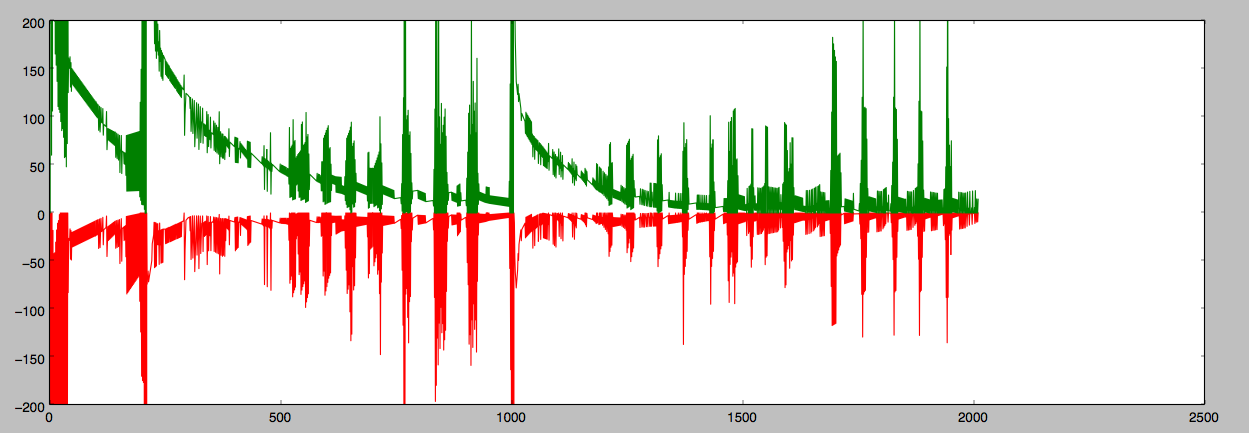
Misclassification error of the two classes. The errors during the spikes were in fact wild pendulum swings between the two classes (once over-classifying as the first class, then over-classifying as the second class, and repeat). I then plotted the components of w to see which ones were misbehaving but unhelpfully it seemed like most of them were:
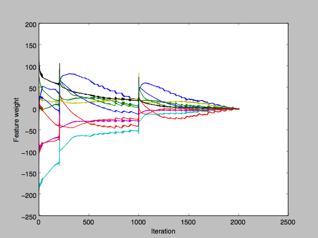
The journey of the individual components of w towards their respective final solutions. I correctly suspected that the w iterative update jumps were too large, but drastically reducing the learning rate η barely changed anything at all, which was baffling. (Meanwhile, the stochastic perceptron was behaving much more predictably.)
Eventually I tried averaging out the gradients for w in the batch, instead of using the sum total gradient, and that took away the big spikes and fluctuations.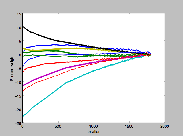
The journey of the individual components of w, after switching to averaging out gradients. - Perceptron Running time: Of the handful of ways I split my dataset into training and test sets, only one was successful at finding a linear-separation hyperplane in less than 2000 iterations. I wasn’t able to find a solution for the others even up to 5000 iterations.
To confirm whether the dataset was indeed linearly separable, I ran scikit-learn‘s version of the Perceptron (which was really quite fast) and I was indeed able to find a linear separator for each of my training subsets, as well as the full dataset (which took a bit longer).
I returned to my code, first speeding up implementation by vectorizing the code that searched for misclassifications (instead of using a for loop). The speed-up was ten-fold! I proceeded to run my earlier training sets for longer iterations, and indeed found separating hyperplanes. Running the perceptron on the full dataset took considerably longer (12.5 million iterations) but it did eventually find the hyperplane. - Dampening the learning rate: Playing around a bit more with η, I found that if I apply certain rates of dampening, the perceptron can converge in just half of or a third of the number iterations. Indeed, for the full dataset, I was able to find the separating hyperplane in just 2 million iterations (versus 12.5 million without dampening.)
- Proof of convergence: On a side note, it turns out that there is actually a mathematical proof showing that a perceptron will always converge if the data is linearly separable. (Convergence Theorem (Block, Novikoff, 1962))
- Further work: Some ways I could take this implementation further:
- Regularization. I played around with this but it didn’t seem to do much. In fact, depending on the value of the regularization parameter, this might prevent the perceptron from converging. Further exploration is needed.
- It would be interesting to average out the hyperplane solutions across multiple runs of the perceptron, in an attempt to create one with good margins.
- More vectorization to speed up the implementation.
Wrap up
This was my first downloaded dataset, and implementing 3 classification algorithms for it taught me a lot. The 94% – 96% accuracy achieved is quite good.
That said, there are many more algorithms I yet plan on implementing, and many more datasets I yet plan on exploring. Time to move on!
Update: March 1, 2018
Logistic Regression
I was able to obtain the linear separating hyperplane using Logistic Regression under certain settings (notably, without regularization.)
With appropriate regularization, I obtained a test accuracy of around 97% which is pretty good.
k Nearest Neighbor
Running k-NN on the WDBC dataset, I got a test accuracy of 96-98%, depending on the portion of the dataset I used for test. I didn’t find a consistent pattern to pick a good value of k, but k=5 gave good results, and in one case k=8 gave a 99.3% test result.
Update: March 22, 2018
SVM classifier
The SVM classifier also worked quite well on the WDBC dataset. The hard-margin linear SVM was able to find the hyperplane and give a test accuracy of around 95%.
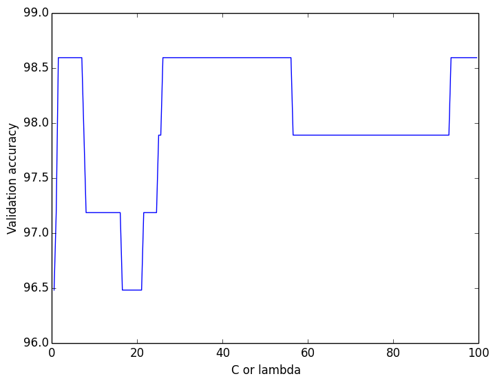
For the soft-margin linear SVM, I ran cross-validation to find the best lambda value (slack parameter), but there was no clear pattern (see figure).
Using a lambda of 40, I got a test accuracy of 95.8% for the soft-margin SVM
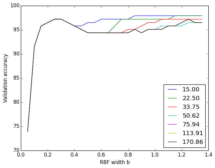 For the soft-margin RBF kernelized SVM, I ran cross-validation across the lambda value as well as the RBF width b.
Using a lambda of 100 and b of 0.3, I got a test accuracy of 95%. (Kernelized SVM doesn’t have much to offer over linear SVM for such linearly-separable datasets)

